Portland architecture

Designing for a new way to provide healthcare for kids by Matt Loosemore

BRAVE_CARE_EXTERIOR_1.jpg

Whether it’s their 24/7 nurse line, onsite lab and x-ray, or symptom checker tool, Portland-based Brave Care makes it easy to get the care kids need through urgent care, wellness checks, and virtual care visits.

Their mission is to provide impactful pediatric care that’s fueled by empathy, research-driven, grounded in trust, and made more personal with the support of modern technology.

That’s why we were thrilled to design their new, 3,500-square-foot location in Portland’s Sellwood/Westmoreland neighborhood. 

We were able to fast track the project through the City of Portland with the assistance of Faster Permits due to Brave Care’s ability to provide pediatric COVID services such as testing and treatment. We anticipate a completion date of July 2020. 

SUM drove the design of the branded tenant improvement project through the use of materials like concrete and birch to communicate a clean, simple, inviting aesthetic. 

Our ultimate goal is to provide a flagship location with an original design that can be replicated in multiple locations for the fast-growing urgent care organization. 

Welcome to the neighborhood!

Partners
Contractors: BnK Construction Inc.
Permitting: Faster Permits

Introducing The Mad Dog Block, an adaptive reuse project in Central SE Portland by Matt Loosemore

Screen Shot 2020-03-11 at 2.39.28 PM.png

The permits have been filed, the design finalized and now it’s time to get to work on The Mad Dog Block. 

The first phase will be an adaptive reuse project that will incorporate two warehouse buildings, both built in the 1920s, snuggled next to the Hawthorne Bridge at 210 and 226 SE Madison Street.

The combined buildings will provide shared amenities and tenants will have private conferencing on the second floor, as well as access to a roof deck and a structure that provides a spectacular view of downtown Portland. The building will also provide break-out and collaborative spaces, an abundance of bike parking, and shared tenant parking.

Building on the Central Eastside’s DNA of bricks, beams and warehouses, the adaptive reuse project will feature industrial and modern finishes throughout and at 55,000 square feet, will provide spaces for small-scale manufacturers, creatives and other small to medium-sized businesses. 

The Central Eastside Industrial District has a long legacy of manufacturing and attracting entrepreneurs and businesses that help drive the local and state economy. As denizens of Central Eastside ourselves, we’re thrilled to be a part of that legacy and build upon it for the next generation of makers and manufacturers.

And by retrofitting existing buildings through our adaptive reuse knowledge, we’re also keeping the district’s history and legacy alive. 

Client: 210 SE Madison OZ LLC
Developer: Libertas Management LLC
Contractor: Truebeck Construction


A new year, a new bank completed and opened by Matt Loosemore

CCB-JoshPartee-Instagram-01.jpg

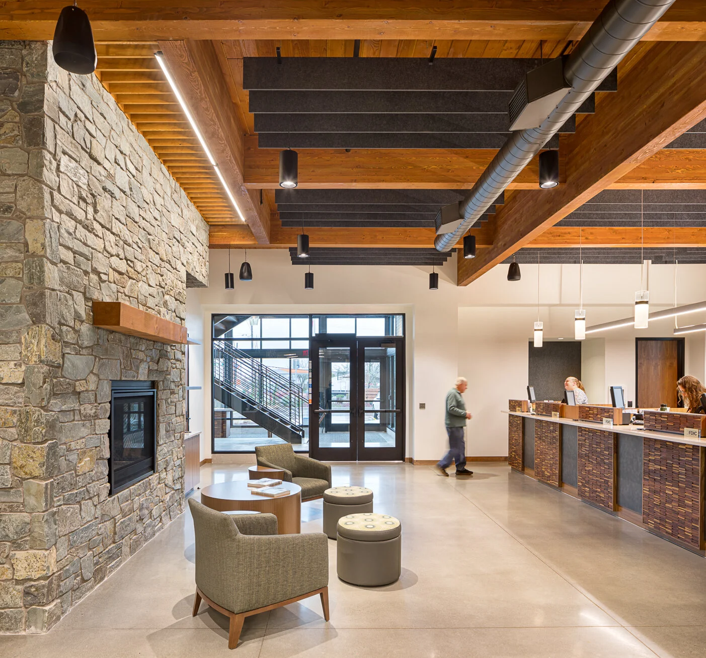
The Clackamas County Bank in Gresham, Oregon, is officially open for business.

The newest financial project designed by the team at SUM features a main floor with main branch area, as well as offices and support spaces. The second floor features offices and a community room where local organizations can gather for meetings and events. 

Adjacent to the community room, customers will enjoy a large outdoor fireplace with rainwater gathered over the entry canopy, flowing down the face of the building in an open downspout. 

For exterior materials, the new branch was clad with 80% light gray and dark gray brick, natural wood and natural Loon Lake stone. 

The new branch complements the culture of the bank: a warm, inviting place that offers a professional but personal atmosphere for its customers. Thanks goes to Bremik Construction for being great partners on the project.

For more information, contact principal Matt Loosemore.

Photos: Josh Partee

Helping an Oregon city blossom  by Matt Loosemore

ESTA.jpg

Downtown Estacada.

We’ve done work in the financial field, the brewing industry, residential and commercial spaces and now we can add community building (literally). 

Over the course of most of 2019 we’ve been working with the City of Estacada’s economic development and downtown revitalization team to help transform a dusty 1938 building into one that will be renovated into a modern space to help revitalize a main street. 

Using historical photography, it was discovered that the Broadway Building had a somewhat dubious addition to it in the 60s or 70s—a common theme it seems. The goal will be to restore the facade of the building, take a historically incongruent facade on Fourth Avenue and bring it into alignment with the downtown and with the building that it's attached to.

BB3.png

Our goal with the Broadway Building: restore the facade of the building, take a historically incongruent facade on Fourth Avenue and bring it into alignment with the downtown and with the building that it's attached to.

SUM is also doing an awning replacement, taking off all of a failed stucco system, exposing the substructure, and then re-stuccoing the facade. By scaling back the existing two facades and breaking up the canopy line, keeping them at a consistent height, and adding more glass into the center space, we're actually gaining an additional retail space.

Though the building will have a bit more modern touch, using a steel canopy, with all new window systems, the old character of the building will remain, this time around with newer amenities.

The Broadway Building is just one project out of many helping to contribute to downtown Estacada’s revitalization and we couldn’t be more pleased to be helping the city shine.

BB2.png

The old character of the building will remain, as well as the newer mural, with newer amenities.

SUM in the News: Propmodo by Matt Loosemore

https://propmodo.com/through-good-design-workstations-promote-office-collaboration/

Eric Hoffman, principal and co-founder, wrote a great piece for Propmodo on open offices, workstations, and how good design can help make even the gloomiest workspaces come alive. Here’s a nugget from his post:

People want to be able to feel like they have ownership in a project—and be in an environment where they can talk and joke with peers and not worry about being penalized for it. Don’t let the words “open office” cause anxiety. There are numerous ways to still have plenty of light, privacy, and room to breathe, even in a space were the staff work in workstations. Good design ensures this.

 To read the whole piece, go here.