Brave Care’s new location offers design that meets healthcare for kids by Matt Loosemore

Brave Care, a modern pediatric healthcare company dedicated to improving care for kids so they can reach their full potential, was founded in 2018, and recently raised $10M in Series A Funding. With this funding they will continue to grow and expand their empathy-fueled, research-driven care and enhance provider-first technology, giving clinicians more time to focus on parents and kids during visits.

Enter SUM Design Studio + architecture. After our success in designing Brave Care’s 3,500-square-foot location in Portland’s Sellwood/Westmoreland neighborhood, we are now helping design their new location just outside of Portland.

Modern meets empathy
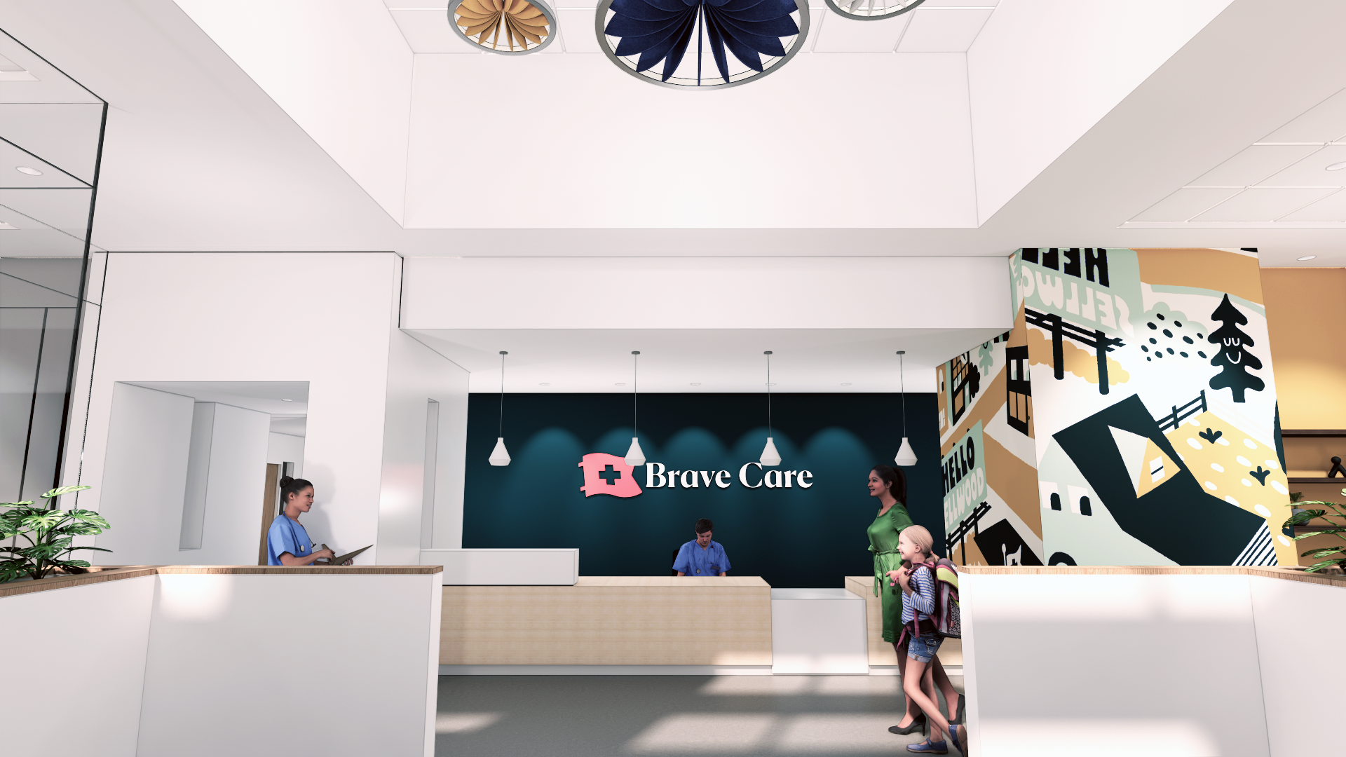
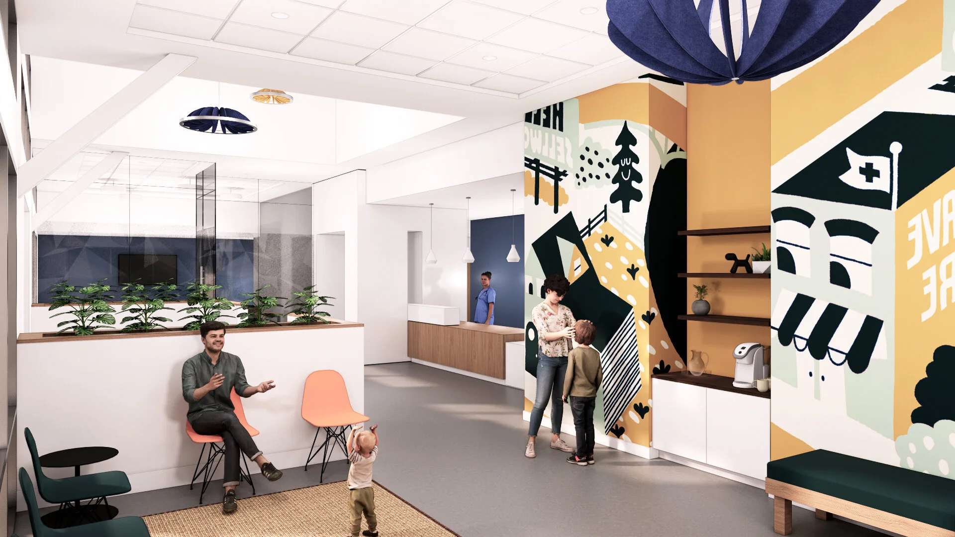
The new location will have modern elements finished in a fun and playful aesthetic with a design concept to help re-envision health clinics to be more inviting to children.

To accomplish this, we designed for concrete floors to be utilized throughout the lobby and waiting areas, with lofted ceilings and whimsical, multi-colored light fixtures above.

Full-height glass walls will open the lobby to the community room, helping natural light flood the space. The maple and white laminate reception desk will be adjacent to the glossy white portal that leads one to the rest of the clinic. Attractive contemporary flooring that meets strict cleaning requirements, wall tile and finishes will be used throughout the back of house spaces.

This will allow a specific flow and usability for staff to make this space successful. By communicating with Brave Care workers, we were able to incorporate these elements into the design of the staff areas and casework to best fit their technology and workflow needs.

More room to grow
The new location is near twice the size of Brave Care’s Sellwood/Westmoreland location. Though much of the program and design elements are the same, the new location will include larger common spaces and staff areas. The facility will also offer conference rooms, community space for after-work care clinics, web conference space, X-ray capabilities, and eye and ear specialties. As Brave Care grows, this larger clinic will allow for more staff to assist a larger patient base.

Brave Care’s overall goals are to establish a design precedent and branding for future locations. As Brave Care expands, there will be a strong continuity between clinics that care seekers will become familiar with. We’re excited to travel with Brave Care as they continue to offer empathetic healthcare for kids and expand not only across Portland, but across the country.

Designing the next-gen office: It’s simpler than you think by Matt Loosemore

3.png

The promised future tech to keep office workers safe in 2021 and beyond has started to materialize from Star Trek sci-fi to reality. HVAC systems that used to provide cool or warm air are being upgraded to now supply clean, safe air. From touchless doors throughout an office to temperature stations at front desks, many large, multi-floor, multi-location corporations are on board with the new technology.

But, what about small-to-medium sized offices, with one or two floors, without thousands of employees that need that much technology? According to SalesForce, more than 90% of the business population represents small and medium-sized businesses—and these businesses, whether office space or manufacturing, want their employees to be comfortable and safe, too.

You’re not Microsoft? You’re not alone. Here are some of the ways we have always helped clients make their offices more than just places to work, but good places to be.

Make workstations work better for ‘revolving’ employees
The majority of business owners I work with will allow employees a staggered work schedule: work from home part-time and come into the office part-time, aligning with overall national trends. This paradigm shift will drive building and business owners to use the same amount of, or even less, space for more people than what’s currently needed. One example is taking a workstation traditionally set up for one person and manipulating it to be available for two people working on alternate days. Each employee takes ownership of a personal mini “locker” or movable drawers to store a keyboard, mouse, ancillary and personal supplies. When it’s their day on the job, they can take out their mouse and keypad and get to work. These staggered schedules will likely become the norm.

Smarter use of space
Office spaces need to be more human-centric than ever before, and the office will have to react to that, from the layout to square footage used. Offer gathering areas for small, medium and large-sized groups, with an emphasis on smaller gathering spaces for 2 people. Employees will want more break-out spaces such as beverage stations with coffee bars, water or small refrigerators so they don’t have to congregate to get a beverage. These stations will have wall space to hang notices and office updates to keep everyone informed and connected. Smaller work nooks will be sprinkled throughout an office for secluded workspaces away from desks with smaller collaboration huddle areas near workstations for small group work sessions. These kinds of spaces shouldn’t be thought of as amenities, either. The workforce will expect it.

Provide clean air
We’ve always considered indoor air quality when designing office spaces. There are many ways to provide clean air, depending on the space. Chances are you’re retrofitting a current space and installing inline filtration to an existing mechanical system so there’s less recycled air and even more fresh air. An even simpler solution? Open up windows that have been painted shut for decades for increased airflow. That may sound simple, but it’s effective. You don’t have to solely rely on mechanical systems to bring in air.

Make spaces... just better
Clean fresh air, comfortable spaces, and less crowded workplaces are all key to making physical workspaces, well, work. There are other small touches that can create a sense of belonging and community or a less sterile but safe workplace, too. Consider something simple like bringing in houseplants or adding skylights or an atrium that provides daylighting. Use natural finishes like brass, copper, or other metals. Not only do they convey a warmer vibe, they’re naturally antimicrobial and easy to clean. If you have the opportunity with a new building, take advantage of operable windows for fresh air and design for outward views that include seasonal views of trees, rivers or open landscape. Consider providing roof spaces and decks, again, for the views, but also for the fresh air, outdoor meeting spaces, or even a space for a community garden for employees. 

More than ever, the next-gen office needs to provide spaces to socialize, spaces to work effectively and comfortably, and places for employees to connect with each other. These concepts aren’t new by any means, but they work.

As more people are vaccinated and employees head back to the office, now is the time to research, prepare and provide for adjustments to the workplace aimed at a workforce that has completely changed. What many employers are realizing is that most of us are social beings, whether that’s in the workplace or at a party. A recent JLL report sheds some major light on this fact, too: 74% of employees still want the ability to come into an office. How you provide for them will be crucial in successfully moving forward.


Interested in learning more? We’ve developed a toolkit to help guide you as you and your team re-enter the workspace.


Fibre Federal Credit Union: Cross-laminated timber for the win by Matt Loosemore

2.png

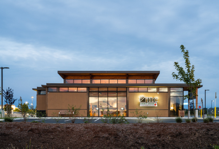
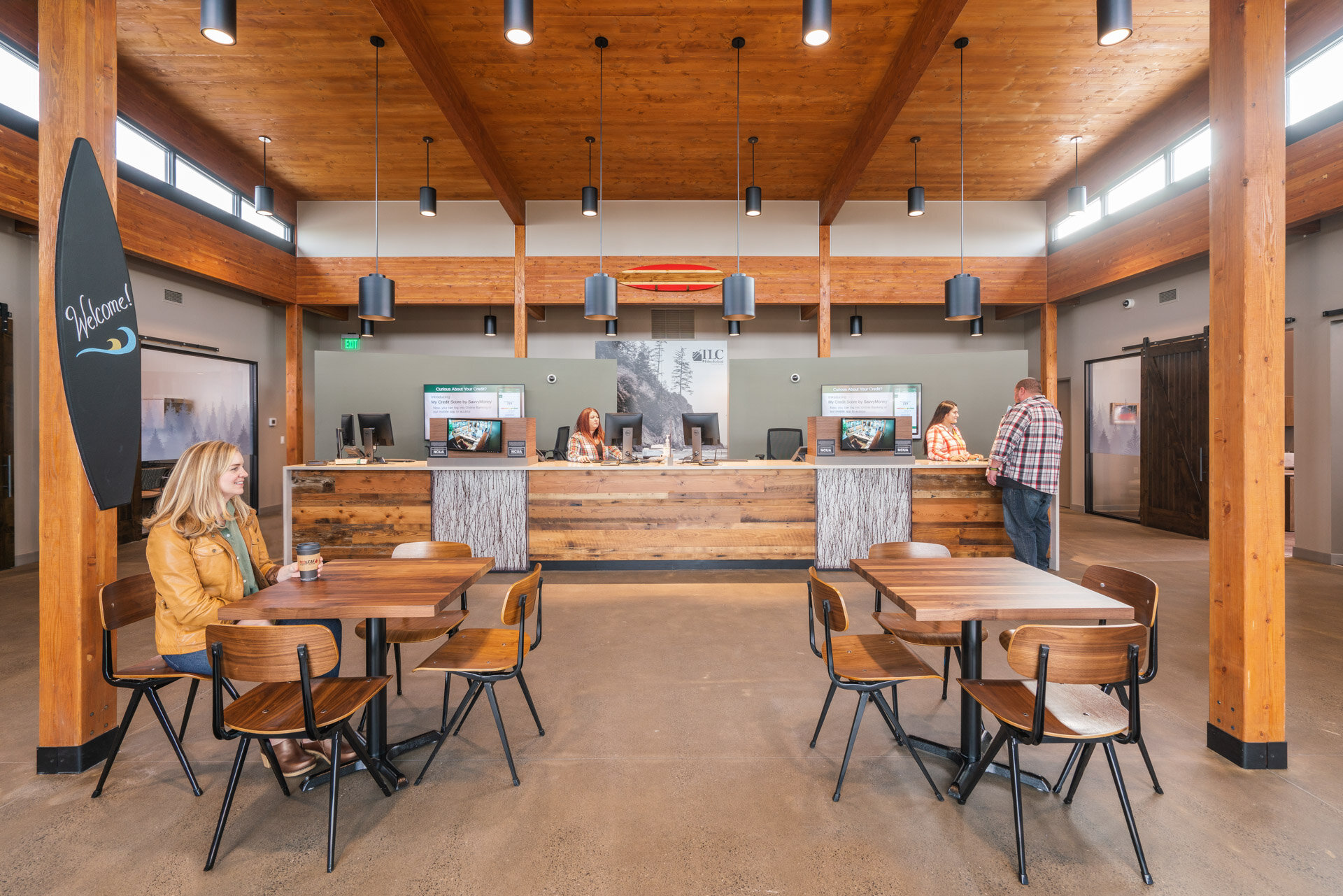
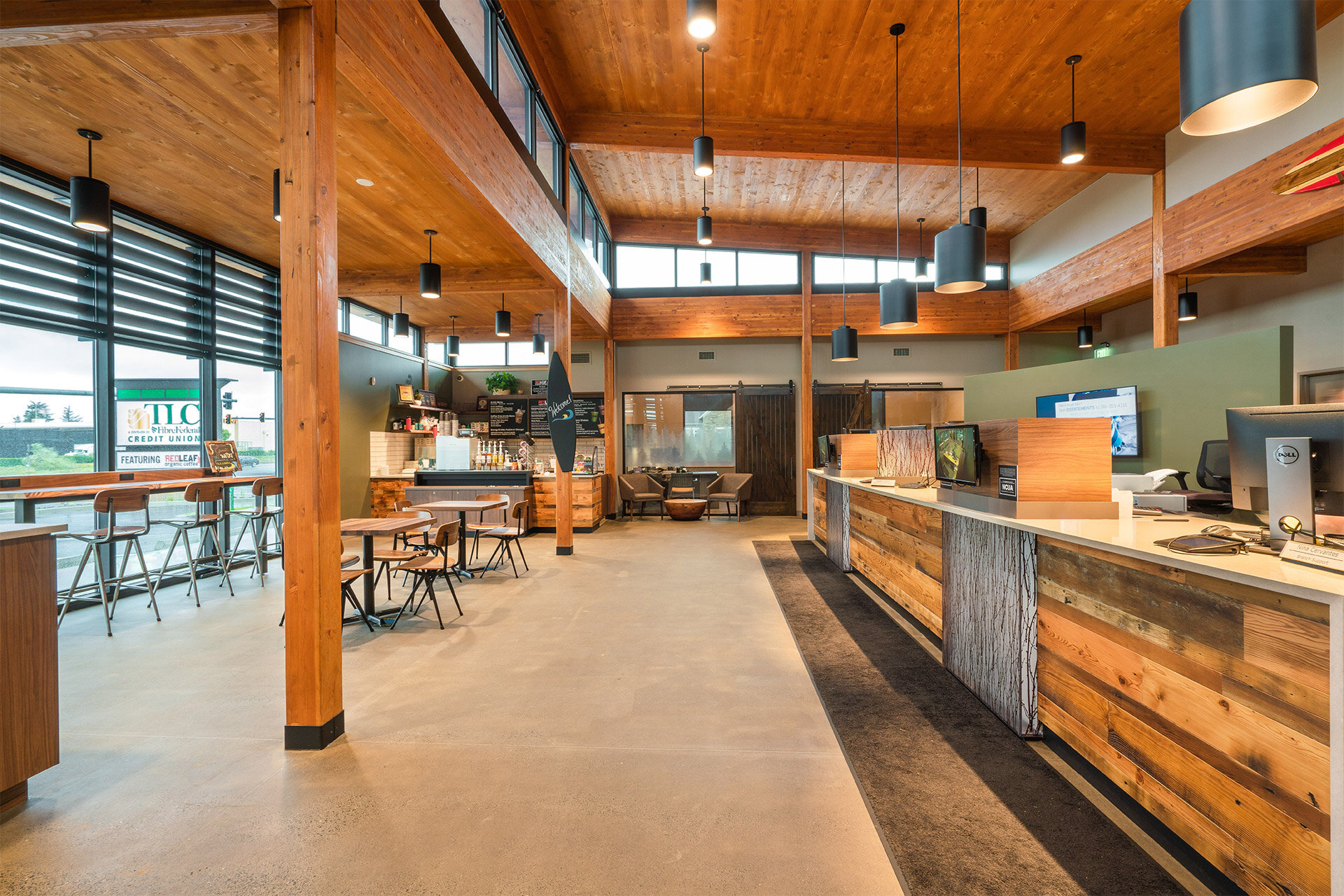
Just completed this fall, Fibre Federal Credit Union in Warrenton, Oregon, boasts some impressive materials, including a cross-laminated timber (CLT) ceiling/roof structure and glulam post and beam.

At 3,234 square feet, the modern contemporary credit union was designed using construction detailing and materials to withstand the harsh marine environment, such as rainscreen, ceramic panel cladding, manufactured stone, specialty stains and finishes, and deep soffits. 

Our goal was to create a fresh and appealing space for potential clients, with fresh contemporary materials, a bright and open floor plan with lofted ceiling, clerestory wraps, and a building that showcases the CLT continuous from exterior soffit to the interior ceiling. Result? Success!

We’re thrilled to complete another savings and loan project with Momentum. Kudos to the entire team for being great partners. 

For more information, contact principal Matt Loosemore.

Photos: Momentum 


Tour our Factor Building project by Matt Loosemore

Sqauresapce.png

Last week we celebrated the signing-off of permits for our newest project in Portland’s Central Eastside. 

Formerly the Mad Dog Block, we’ve renamed it the Factor Building, a play on the Italian translation for “maker” or “creator.” 

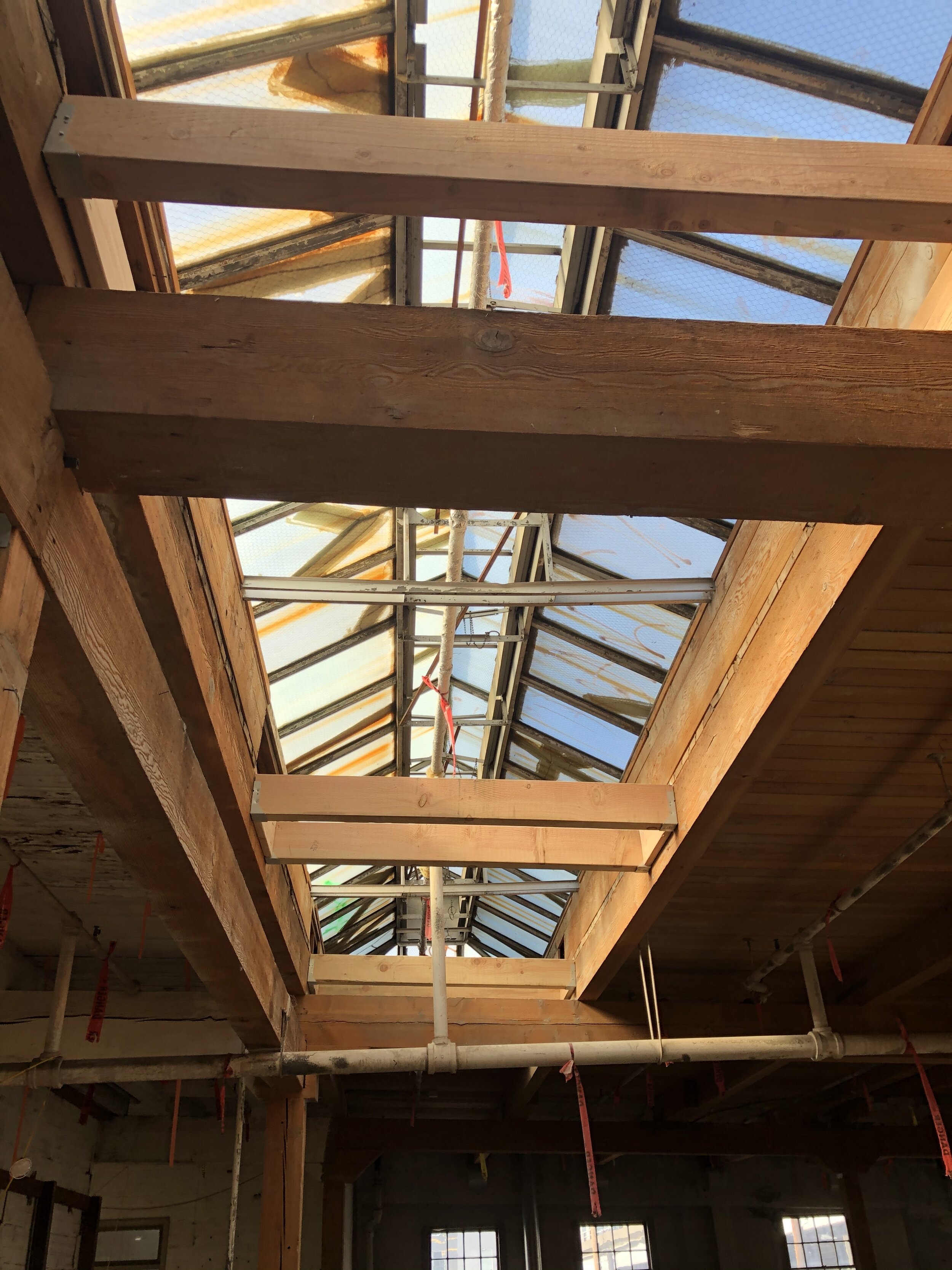
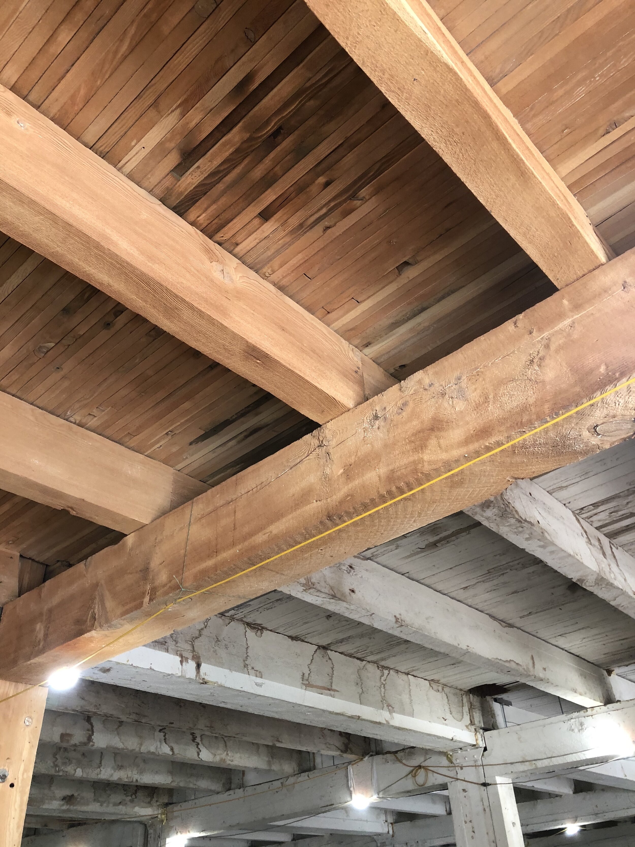
The 55,000 square feet adaptive reuse project will incorporate two warehouse buildings, both built in the 1920s, snuggled next to the Hawthorne Bridge at 210 and 226 SE Madison Street. The combined buildings will provide spaces for small-scale manufacturers, creatives, and other small to medium-sized businesses. 

After we celebrated with some grilling and cold beverages we toured the space to see some updates, from sandblasted ceilings to the new elevator shaft to framing. 

Things are moving forward!

Post-COVID design is good design by Matt Loosemore

Covid plan labeled.jpg

If you missed part one or two of my previous articles, I illustrated where SUM sees office design heading based on the long-term effects of COVID-19 and what workplaces will look like. For my final piece, I’d like to stress that post-COVID design is just that: good design. Good design worked before the pandemic and will continue to work after COVID has been tackled. Here are some of the ways SUM Design Studio has always practiced good design to create successful workspaces.

We look for the best site selection
If you’re constructing a new building, site selection is an important decision. SUM aims for property that takes advantage of views outward (think parks, trees, grass, rivers, or distant views through building corridors and even skyward). Consider seasonal changes and exterior access around the site or from a rooftop to get people outside for meetings or social gatherings. Exterior spaces should become extensions of the interior used by staff for workspace, small meetings, or group conferencing. Placing a building on a site is important because it can allow occupants to control daylighting and allow group access to fresh air through operable windows. 

Surrounding a building, SUM deploys natural and native landscapes that require less watering, but also thrive in the surrounding climate and complement your design (in other words, here in Portland we don’t plant cacti and other desert plants). We've always been a firm that designs Northwest Contemporary and timeless design for interiors and exteriors, or buildings that are true to their nature, true to where they are creating a sense of place.

We create human-centric spaces
We don’t typically design for more than 24 workstations or workspaces in an area. More than that, people start to feel like they're in a sea of faces and lose place identity. SUM likes to create work clusters or neighborhoods that encourage staff to actually know the people around them. When your employees feel comfortable with the people next to them, they begin to feel more protected and part of a team.

 We like to break up giant oceans of workstations by creating these neighborhoods of stations, separated by phone rooms, break out space, conference rooms, nooks and booths, and private offices. This makes each area feel like a safe zone for those people working in it, with access to daylight and operable windows.  Additionally, we like to move open concept breakrooms, boardrooms, IT, and storage to the building core, giving more window line to staff.  These efforts make employees feel like members of a community versus just a number on the firm’s spreadsheet. These design considerations also create spaces for both the introverts and extroverts in your office. Each of these groups will work better in the spaces you provide them (think: big, open spaces at WeWork versus their “phone booth” spaces).

We use green to inspire
Biophilia is hugely popular now, and for good reason. From massive green walls in lobbies, built-in planters and plants in pots around offices, having green in an office can help lower stress and increase creativity. And, it just looks cool. By bringing the outdoors in, you also provide clean, fresh air and a natural-feeling environment. Houseplants in a cubicle or space can soften the hard edges of an office, too. To take it a step further, we’ve created atriums in buildings, allowing occupants in an interior space to receive daylight and enjoy the plantings in the atrium space. Biophilic strategies like these also help bring fresh air into a building through openings versus just relying on a mechanical system to bring air in.

We use natural finishes
When it comes to finishes, we typically focus on using more natural elements. We choose building exteriors of stone, brick, wood, concrete, and steel and interiors using natural materials such as brass, copper, and other metals. We opt for solid wood, paneled wood elements, and fabric selections like cottons and wools that are naturally antimicrobial and easy to clean vs petroleum-based products.

These materials and finishes not only look pleasing, but their health benefits to a post-COVID office are immense. We believe that the use of material should be a true expression of what it is. If you want a wood look, use wood. If you want a stone aesthetic, use stone. 

Parting advice
SUM has always focused on exploring the environment around us, bringing that environment to interior and exterior spaces, and providing a holistic experience in an office versus an enclosed, tight, controlled environment. In a post-pandemic world, we will continue to provide workspaces that are naturally healthy and inspiring for their occupants.

If you want to sit down and have a conversation about what your office will look like post-virus, we’re already there. Please reach out —I’d love to chat.

Red Canoe: New ways to serve credit union members by Matt Loosemore

RCCU Lake Tapps-1.jpg

We’re thrilled to announce a recently complete, and newly branded, Red Canoe Credit Union project through another successful partnership with Momentum, Inc.

The new branch located in Auburn, WA., will provide members with modern, cutting-edge design incorporated throughout. 

Complementing Red Canoe’s plans to enter new urban markets, explore the future of financial retail, and experiment with new technology, we worked with Momentum to ensure the credit union’s image still reflected a relaxed Pacific Northwest atmosphere. 

We included design elements like 24/7 access to an ITM (Interactive Teller Machine), ADA restrooms, a greet station with custom casework, and three “hotel-style” offices. Of course, open spaces will complement some of the current social distancing rules in place but are adaptable to be transformed into other usable spaces in the future. We also provided a kids/wait/refresh area with custom casework and soft seating, and a feature wall with graphic integration and new exterior signage.

For more information, contact principal Matt Loosemore.

Photos: Nakean Wickliff.