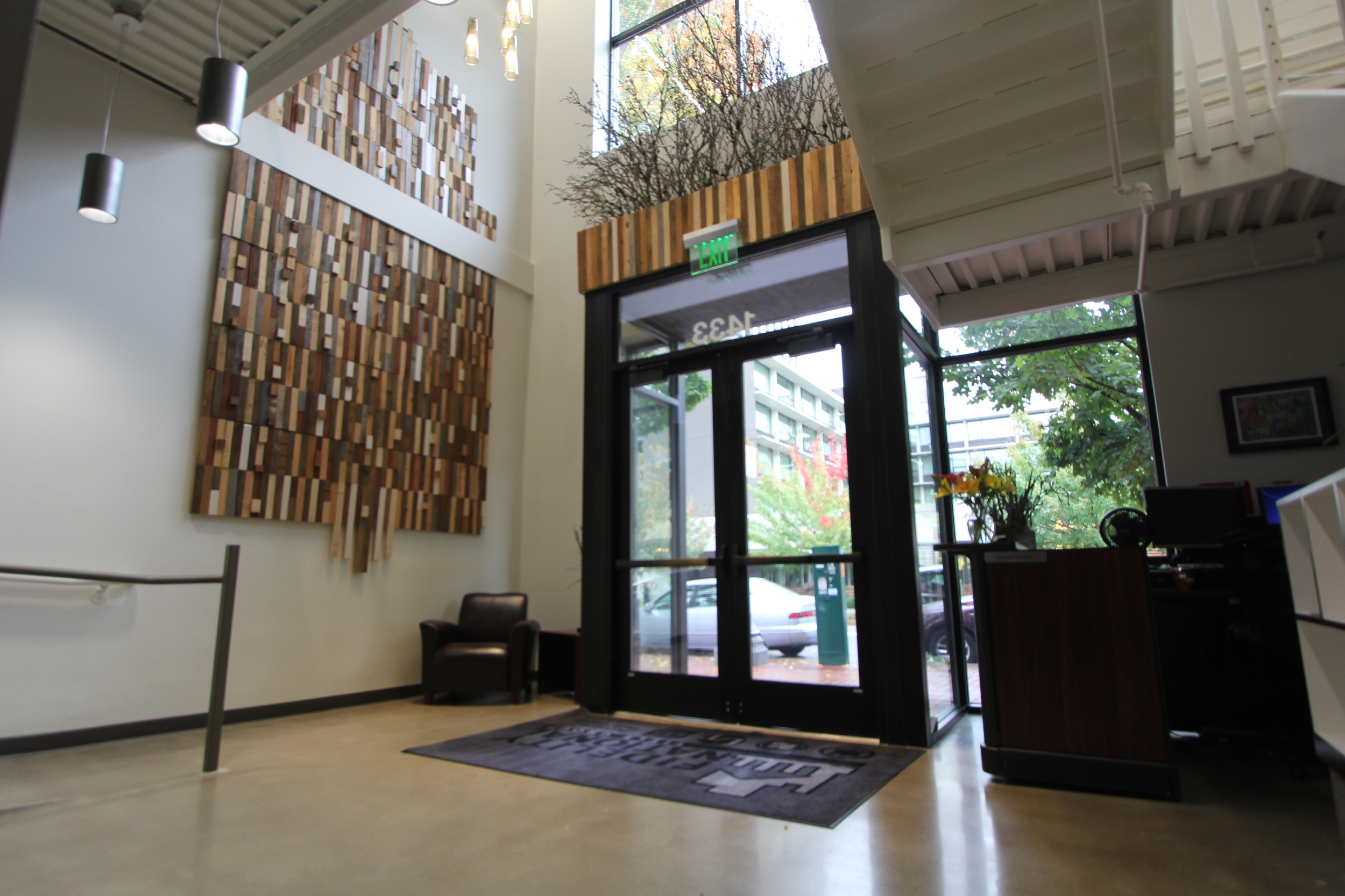


Longstanding client Harsch Investment Properties brought SUM the task of bringing light and openness to a two story masonry building in Portland’s University district downtown. A tired and understated existing entry to the building became the focal point of change, as SUM’s design team envisioned an open, double-height space, with light pouring in from floor to ceiling windows and accent lighting overhead. Newly polished concrete floors, and contrasting white and grey wall colors lend a gallery-like feel to the space and form a perfect backdrop for the client’s art collection. The addition of an entry ramp wrapping behind a new elevator make the building universally accessible. Following the upgrades to the building, the entire space was leased and further additions have already been planned by the tenants.
location
Portland, OR
